










Brand & Design System · New York City
Proud, on purpose. The logos, colors, type and voice of Gotham Knights RFC — everything you need to make something that looks and sounds like us.
Who we are
Gotham Knights is New York City's LGBT rugby club. The brand is heraldic and athletic — a dragon crest, deep navy, bold gold — with a tone that is bold, warm, and a little cheeky. It speaks to two rooms at once: the queer NYC community and the players who live for matchday, and the grant officers and sponsors who fund the club. So the system ships in two registers.
Gotham Black all-caps energy. Posters, socials, hype, recruitment — the swagger that fills a pitch.
Modern Hanken headings on cream. Decks, grant applications, sponsor one-pagers, the calmer pages.
Both share one palette and one type-family set — only the emphasis changes. The club is proudly LGBT, but the identity leads with navy + gold confidence. Pride shows up as a deliberate spectrum accent — a thin rule, a single highlighted moment — never a default gradient on everything.
Voice & tone · How we write
The club has swagger and a door held open. We speak as "we" (the squad) and address you as "you." A wink is welcome — it never punches down, and inclusivity is structural, not decorative.
COME PLAY.
TUESDAY NIGHTS, WALL STREET.
NO EXPERIENCE — BRING YOURSELF.
"One of New York's longest-running inclusive rugby clubs. We field competitive sides while keeping our doors open to players of every background and skill level."
Logo system
The dragon shield is the brand's strongest icon — a badge, watermark, and bullet mark all at once. The horizontal and stacked lockups pair it with the Harbour wordmark. Never redraw the crest by hand; always place the supplied vector.

| Mark | 2-color | Navy · 1-color | Black | White · knockout |
|---|---|---|---|---|
| Shield | SVGPNG | SVGPNG | SVGPNG | SVGPNG |
| Horizontal lockup | SVGPNG | SVGPNG | SVGPNG | SVGPNG |
| Stacked lockup | SVGPNG | SVGPNG | SVGPNG | SVGPNG |
| Wordmark | — | SVGPNG | SVGPNG | SVGPNG |
Use 2-color on light backgrounds; all-white or knockout on navy and photos. Prefer SVG wherever it's accepted — it stays sharp at any size. Download everything as a .zip.
Protecting the mark
Clear space (X) equals 30% of the crest's height — scale it up or down with the logo. Keep X clear on every side; nothing — type, photo edges, other logos — enters this zone.
Crest never below 24px / 0.25in. Horizontal lockup never below 120px / 1.25in wide, so "Rugby Football Club" stays legible.

Prefer the supplied lockup files — only rebuild when you truly must. Set the space between crest and wordmark to one-sixth of the crest's height, the ratio drawn into the supplied lockup. Measure to the nearest ink, not the file's bounding box.
Center the wordmark block on the crest's height; the "Rugby Football Club" line sits inside, not below. Match colors exactly: navy crest + navy wordmark, or all-white.

Color · Two heroes, sampled from the crest
Click any swatch to copy its hex. 700 is the primary.
500 is the primary. Step down to the darker tints for text on light.
Neutrals are intentionally warm — a cream #FBF7EE paper rather than cold white — which keeps the professional mode from feeling clinical. For gold text on light backgrounds, step down to gold-700 for contrast.
Color · Support palettes
Warm, slightly muted to sit beside navy + gold. Used as a thin rule or a single highlighted moment — a deliberate spectrum, including the Progress flag additions. Never a default gradient.
Core six · red → violet
Progress additions · trans · brown · black
Apparel · Manufacturer reference
For printed graphics, hangtags, and screen-print inks. Match to physical Pantone chips only — never to this on-screen render. For dyed fabric, request the equivalent Pantone TCX / TPG textile standard.
Typography · Four voices
--font-heading)--font-athletic)Typography · Rem-based, 1rem = 16px
display-2xl · athletic88pxdisplay-xl64pxdisplay-lg48pxdisplay-md36pxh132pxh224pxh320pxbody-lg18pxbody16pxbody-sm14pxcaption12pxoverline11pxHeadlines run tight — --lh-tight 0.95 to --lh-heading 1.18 with negative tracking (-0.02em). Body breathes at --lh-body 1.55. Eyebrows are the only all-caps in the modern voice, at +0.16em. The Harbour wordmark tightens to -0.05em to match the official lockup.
Layout · 4px base scale
6–10px for most UI, 16px for large feature cards. Pills only for chips, tags & avatars. Nothing is bubbly.
The brand likes a confident 2px stroke — gold or navy outlines on cards, buttons, and the crest itself. Hairlines for quiet dividers only.
Layout · Restrained, navy-tinted
Cards lift with a soft --shadow-md; the gold glow is reserved for the primary CTA on dark. Cards use a flat fill + 2px border or a soft navy shadow — rarely both.
Fades and short slides; no spring or bounce on UI. Press nudges 1px down — never a cute bounce. Respect prefers-reduced-motion.
A 3px gold ring at 2px offset, on every interactive element. Transparency & blur used lightly — a navy scrim over photos, a translucent sticky header. Not frosted-glass everywhere.
Building blocks · Actions, labels, surfaces & data
All bodies, all levels — welcome here. No experience? Perfect.
Building blocks · Brand textures
Seven reusable surfaces, shipped as .gk- utility classes that run from loud to a whisper — reach for the quietest one that does the job. Loud by nature: use sparingly — borders, bands, accents, single moments. Never wallpaper a whole layout.
The checkerboard is the loudest thing we own. Reserve it for borders and hard frames — never as a fill behind content. The halftones fade their dots, not the surface, so edges and borders stay solid. The pride rule is one deliberate spectrum line, never a default gradient.
Checker — frame content with a thin band.
Stripes — a slim accent edge or footer.
Duotone — behind one short, bold headline.
Gotham Knights field competitive sides while keeping the door open to players of every background and skill level. No experience needed.
Don't fill the field — copy becomes unreadable.
Don't cover large areas — it fights everything.
One of New York's longest-running inclusive rugby clubs, fielding competitive sides across multiple divisions throughout the season.
Don't run paragraphs over the dots.
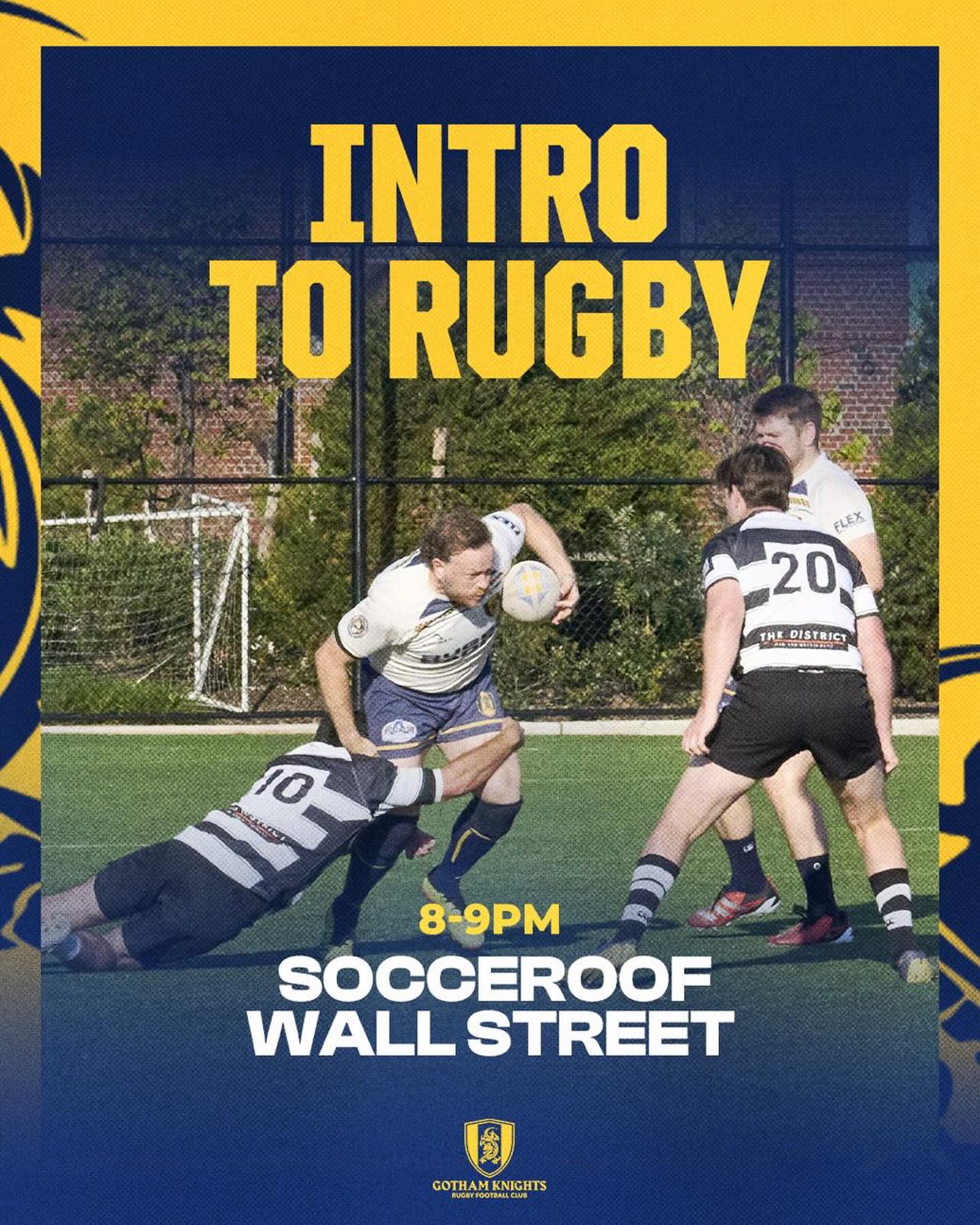
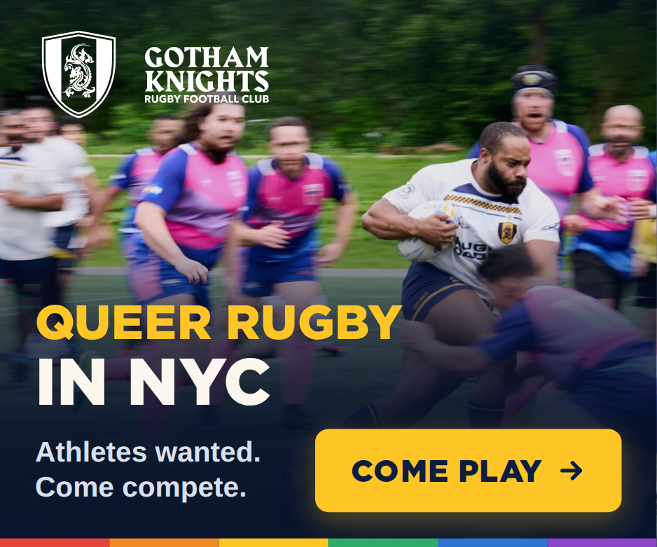
Three background modes: solid navy field, warm paper, or full-bleed matchday photography with a navy scrim and gold type over it. No noisy gradients, no purple. A faint paper texture is fine; loud mode stays flat navy.
Building blocks · The crest leads
The brand has no proprietary icon font. Its signature "icons" are the crest, shield, and dragon — used as badges, watermarks, and bullet marks, not decorative line icons.
Use the shield as a favicon, bullet, loading mark, or section divider. Fill style only for the crest — never reoutline it.
A documented substitution (no club icon set exists): Lucide, 2px stroke, 24px grid, round caps — matching the brand's confident --bw-base stroke.
Emoji and Unicode are not used as UI icons. The brand's energy comes from type and color, not emoji. Stroke weight stays at 2px to echo the brand stroke; the crest is the only fill mark.